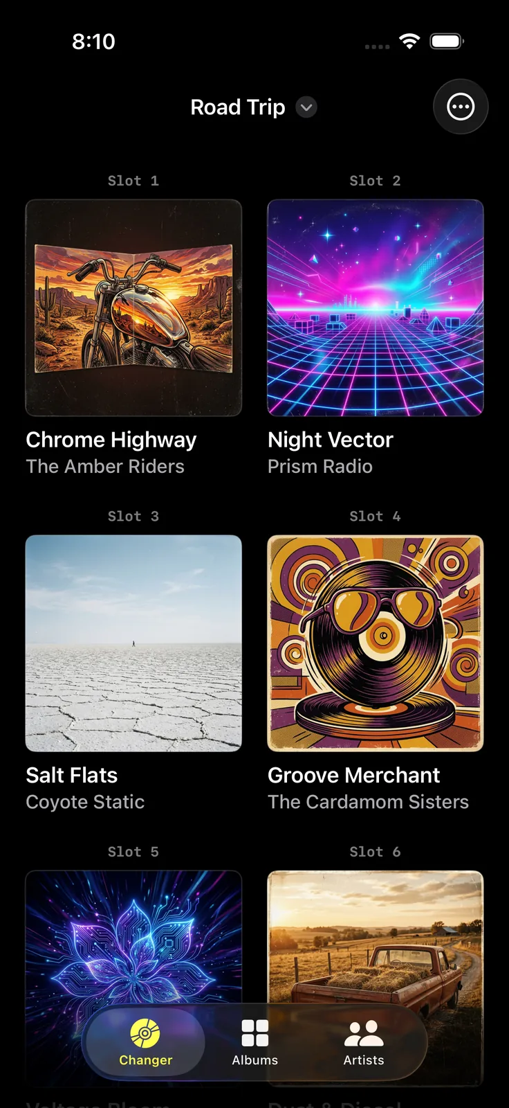
When I shipped this back in May the whole idea was that you load up a magazine and then you don’t have to think about it anymore. Hop in the car and go.
That mostly worked. The problem was if you forgot to add a magazine you couldn’t get to it! What?! I’d have to switch to Apple Music or beg Siri to play the album, yeah we gotta fix that.
So 1.3 is mostly me fixing that. Plus the cool new grid view added in iOS 26 and finally fix the album art loading problem.
Version 1.3
An Artists tab in CarPlay
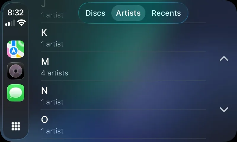
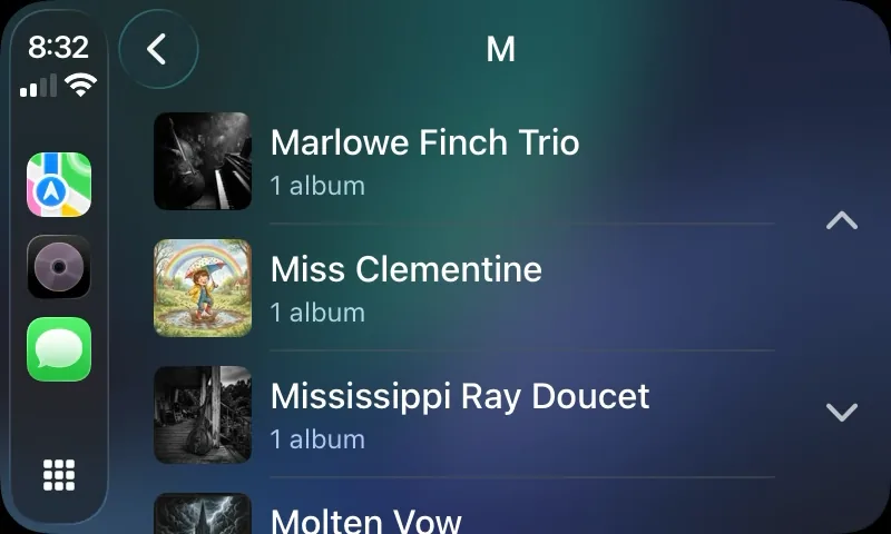
There’s a new tab in the car. Pick a letter, pick an artist, pick an album, and it plays. No need to leave for Apple Music any longer!
The letter step looks like a design choice but it isn’t really. CPListTemplate.maximumItemCount caps how many items a template can hold and it counts across every section combined, not per section, and when you go over it CarPlay doesn’t scroll or paginate - it just quietly drops the rest. So a flat A to Z list of every artist in a decent sized library would silently stop being complete, which is a lot worse than making you tap one more time. Letters keep each screen well under the cap, and as a side effect you can actually find things at a glance instead of scrolling forever.
Artist rows show the artwork from that artist’s first album. The letter rows deliberately don’t show anything, because resolving artwork for every letter means going out across the library right at the moment you’re sitting there waiting for a screen.
Which gets me to the bad one. On the actual device, tapping a letter had this little beat of nothing before the list showed up, and at a desk that is the kind of thing you shrug at, but in the car it bothered me enough that the note I wrote to myself literally says “dangerous while driving.” Turns out it was resolving all the album artwork before pushing the screen, so now it pushes the screen first and lets the artwork fill in whenever it gets there.
(Wow all of this is a lot more detail than you probably care about, but I am still fretting about if this was the right design)
Albums that fill the screen
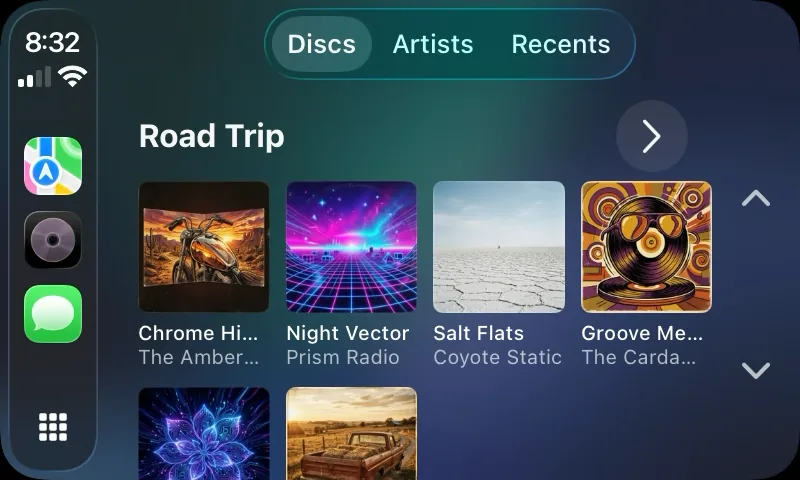
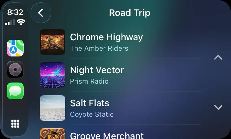
The Discs tab used to show each magazine as a single row of covers, clipped at however many fit. Apple Music’s own CarPlay library view wraps its albums into a grid and that’s cool - so it’s been added!
This one cost me an afternoon and turned out to be one word. CPListImageRowItem got reworked in iOS 26 and the newer initializers take an allowsMultipleLines flag, and my code was already calling the new initializer - it was just passing false the whole time.
Artwork that stops going gray
This is the least interesting section but totally drove me nuts! Album art could come up blank or permanently gray in CarPlay and in the mini player and on the lock screen, and it was worst on Family Sharing albums and on stuff synced locally instead of pulled down from the catalog.
That’s fixed, including the one where CarPlay would fall back to the “No Disc” placeholder for an album that was sitting right there. Cold launch is faster too.
Smaller stuff
- Rebuilt the design system on iOS 26’s Liquid Glass.
- Did an accessibility pass - VoiceOver across the app, a Dynamic Type audit on the icons, and a contrast fix.
- The Live Activity and Now Playing widget are gone, pulled a while back. The system already does that on the lock screen and the one I added was redundant IMO.
The name changed
On the App Store it’s CD Changer: Car Album Player now, which is the same app with nothing else moved - “Digital” wasn’t doing anything and nobody searches for it. Hoping to fix the findability of the app.
What it still doesn’t do
No single songs, no playlists, no shuffling your whole library. No iPad, since CarPlay doesn’t run there and this is really a CarPlay companion app. Your magazines don’t sync between devices yet. And it can’t play anything that isn’t already in your Music library.
Try it
CD Changer is free. You get one six disc magazine, which is a whole changer, and Pro is a one time purchase if you want more than one.
The screenshots below show the rest of it better than I can.
Screenshots